It’s been a long time since I published on this blog; I figured I would go back and revisit one of the more popular posts since the blog’s inception. I’m going back 10 years ago to the resume infographic post. Back then, I was aspiring to become part of the agency landscape once again after taking on my own clients for a while. Since then, I have been on a long and very productive agency career which has yielded some of the best experiences of my professional life; everything from creating a global social media infrastructure for a consumer electronics brand, to developing best in class eCommerce strategies for the world’s largest CPG brand, to collaborating on the strategy to launch the first mass-production electric vehicle in North America.
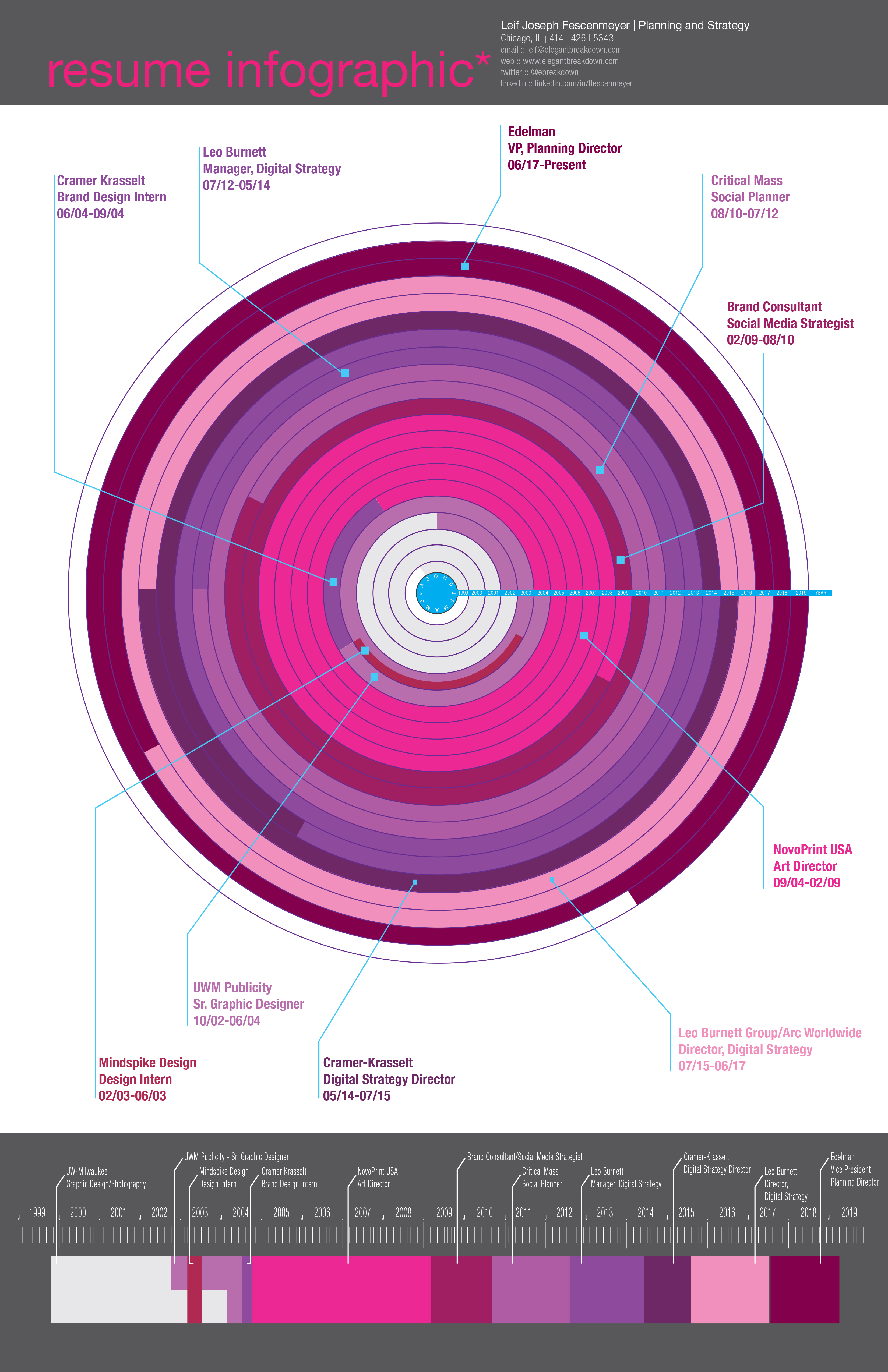
I’m happy to present to you my updated resume infographic. For those of you who don’t know how the first version was structured, here’s an overview:
Section One:
At the top, you will see the title of the graphic, my name, title and contact information. Section Two:
Probably the most visually appealing graphic of the document, the work wheel. This graphic represents the work timeline from 1999 to now 2019. And wrapped around the wheel is the visual chronicle of my work history separated by colors. Lines coming from segments of the wheel define where I worked and when. Section Three:
At the bottom of the infographic is more of a linear timeline of my career path. Color of the timeline corresponds to the place of employment just like in the work wheel above. This timeline is simple, linear and gives you a different representation of work history.
For those of you who would like to learn more about my career history and strategic trajectory, I invite you to connect with me on LinkedIn. As far as the next infographic to come out; well I have no idea what it’s going to be just yet. I’m working on finding a subject matter. And of course, if you have a suggestions, don’t hesitate to let me know.
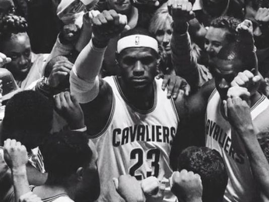
Nike Basketball, in partnership with Wieden+Kennedy, released a LeBron James comeback spot titled, “Together”. It is an “emotional” spot depicting King James’ return to the city of Cleveland. It has been getting a lot of PR and positive reviews lately, especially in the creative industry. Where it is an emotion-provoking spot, beautifully crafted, I began to wonder if the insight was correct.
Now, without going too far into LeBron’s resigning with the Cavs, I think it’s more important to note the negative sensitivity that existed in Cleveland only four years ago. Now, in 2014, all of a sudden it is the “return.” LeBron is welcomed back with open arms by the city he put behind him in the most publicly and somewhat humiliating way? That being said, let’s look at the spot.
Hard work, together. It’s an inspiring and hopeful phrase. The film depicts the entire city coming together and building themselves to a hopeful epoch. It’s the Hope campaign all over again. As I watched this and I remember the past, and as a strategist who prides himself on human truths, I wonder if “Hope” and “Togetherness” was the right idea for the insight. Or, more specifically, I wonder if the insight was correct.
To me, this whole “return” is more dramatic than simply positivity and hope. It’s more than holding our hands and singing kumbaya. It’s more than just the gritty black and white film, it’s more than just giving back to a city that was once destroyed by an ego. And it’s way more than just showing people coming together. To me, the insight is more about the prodigal son returning.
The age old story about a son who disavowed everything and everyone who helped raise him. It’s a story about not being mature and only realizing that once he is out in the world. It’s more about coming home and being humble. It’s about being more than just a star, it’s about giving back, making amends and more so, it’s not about playing a game of basketball to ask for forgiveness.
Together also reminds me of another spot, “Made in New York featuring Derek Jeter. This was a film right on message. It conveyed the true feeling New Yorkers and all those who love baseball had about Jeter. It summarized his character and how the city, how the world truly felt about the man, then the sport. It wasn’t about ego, it was about thanking people.
Just as much as the Gatorade ad, the Together spot is beautifully crafted, it does have the “goose bump inducing” feeling. The ad has a grit to it, it has a feeling of truth and it has an emotive undertone. But the message of Hard Work, Together is about a city rising from the ashes, not about an NBA star telling them how to do so.
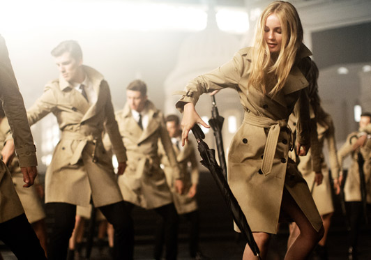
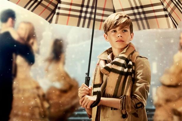
Now, you assumed that Burberry typically does Christmas campaigns and they do, but what is different is this one is global. Yes, that was a bit redundant for me to say, however, coming from my experience working on global accounts, I want to talk about how global campaigns are somewhat difficult to undertake. Firstly, when creating global campaigns, relevancy in all markets (or a select few primary focus markets) is essential. Music choice, voice-overs, time and more importantly message is important as well. Global campaigns are extremely complex, expensive, highly criticized and difficult to produce.
It’s not my place to tell Burberry what to do with their first global campaign, nor is it my place to assume what their global objectives are. However, what I can do is review the creative from the lens of my experience on global accounts and my experience working in advertising.
It’s beautiful, but needs some refinement.
The Idea: Let’s start with what I assume the idea is, “Christmas is the time for love and giving.” Christmas is also the time for the enjoyment of idealism and merriment which can be transcribed into song and dance. Christmas is tough, it’s tough to differentiate yourself within the Christmas season, especially if you are a clothing retailer. The campaign does feel a bit scripted and predictable, however, the song and dance is a nuance that not all brands can leverage or, furthermore, own.
Music: The new track by Ed Harcourt is brilliant. It captures the essence of the Christmas season and the feeling of idealism and love. However, it doesn’t feel as though it “fits” with visuals. There are some relevant cuts and timing with the dance and the storyline, but all in all, the track feels a bit forced to be a part of the story. At times, the music with the spot feels as though they are two disparate pieces of creative jammed together; less of a solution and more like a suspension. Additionally, I’m not sure why the track is not available until December. It would make sense to release the track at the same time of the campaign launch.
Art Direction: First off, Burberry did not disappoint with the art direction. They have always been at the top of their game when it comes to finely crafted spots, beautiful tones and color, and the perfect balance of product and lifestyle. This spot almost feels as though it’s a print ad, Burberry print ad come to life. The look and feel of Christmas does come out, however subtly. Christmas is a magical time of celebration and merriment, regardless of which religion you are apart of. The snow showers and the dancing in the snow whilst wearing Burberry coats and scarves perfectly encapsulates Christmas from a Burberry point of view. All in all, I can’t even begin to tell you how much I appreciate the art direction in this film.
Four Minutes: I’ve experienced this time and time again, the four-minute “film” on YouTube. I understand that this is more of a music video, more of a campaign launch film than a TVC. However, as marketers, we do have to understand the consumer and determine whether or not one has the time to sit through at four minute film on YouTube. According to Google, after the first 15 seconds of every video on YouTube, that’s when viewers are most likely to drop off. That being said, there’s something to be said about crafting great pieces of art and content. Just as much as we talk about viewership, we also need to keep in mind the types of devices consumers use to watch YouTube videos; there are certain markets in the world where consumers are more likely to watch YouTube on a mobile device than on a laptop. So, who actually watches four minutes on a mobile device when walking around? In the end, let’s keep time in mind when creating spots.
Celebrity Casting: Don’t even get me started about celebrity casting. Yes, I see the buzz value in casting a celebrity for a campaign and leveraging their influence to generate buzz and excitement. However, as we have seen in multiple examples including Honda’s latest “Type R” campaign, it’s not entirely necessary. I believe the Burberry Christmas campaign would have the same influence whether or not they casted Romeo Beckham; especially since I just found out he existed. Don’t get me wrong, he’s a cute kid and a “cute kid” works for this execution; just not sure if it was necessary to cast Romeo.
Global Relevancy: This is a big one! Now, we haven’t seen a lot of the secondary executions to the spot just yet. They do have some images being leveraged on their Instagram account, but global relevancy is more than just platform activations; especially for a Christmas spot. The subtitle to the campaign is “From London with Love” and that’s all well and good, but London is not the globe; it is a global city, but not necessarily global. How would a market, let’s say, Brazil react to a spot like this? (Especially since during Christmas it’s Summer in Rio). Additionally, we need to look at ethnicity too. This spot is very heavy up on caucasians and doesn’t address the complexity of a diverse set of ethnicities in the world. The campaign is scalable, but not necessarily regionally relevant.
Overall, it is a great spot, but it is lacking alignment with audio and visual; it really needs some refinement. Perhaps, the fix would be as easy as choose a different audio track to complement astounding visuals? It will be very interesting to see how Burberry runs with this idea in their longer-form campaign. Will there be further owned nuances to the idealism? Will there be more song and dance? Will they focus on giving rather than buying? One thing I do know, Burberry are excellent marketers and I can’t wait to see how they make this a case study that we all will use in the coming year.
Well, after months of waiting for this year’s NeoCon, the day finally came and I naturally geeked out with all the design I found within the walls of the Merch. Floors upon floors of designer furniture, materials, artwork and the masses of people from all over the world. NeoCon is kind of difficult to navigate not only because of the the sheer size of the Merchandise Mart and all the floors, but because of the people. However, that is only secondary to the amazing display of furniture and new designs.
NeoCon is truly a designer’s heaven. Regardless of your profession; graphic designer, industrial designer, buyer, showroom attendant, painter or photographer, there is something there for everyone. There are literally about 6 floors of exhibition space inside one of the world’s largest buildings. Some floors feature well-respected and established retailers such as Herman Miller, Knoll and KI. Other floors in the show feature some lesser-known retailers from all around the world including Europe, Japan, and South America. Beyond those retailers, you have B2B suppliers that focus on products such as lighting, flooring, veneer, handles, etc. All in all, there is something for everyone at this show and I’m so lucky to have gone this year (especially for free)!
Coming out of the show, I realize there are some trends moving from 2013 into 2014 in the industrial design world. There are definitely 5 major trends and one behavior trend I noticed.
Trends:
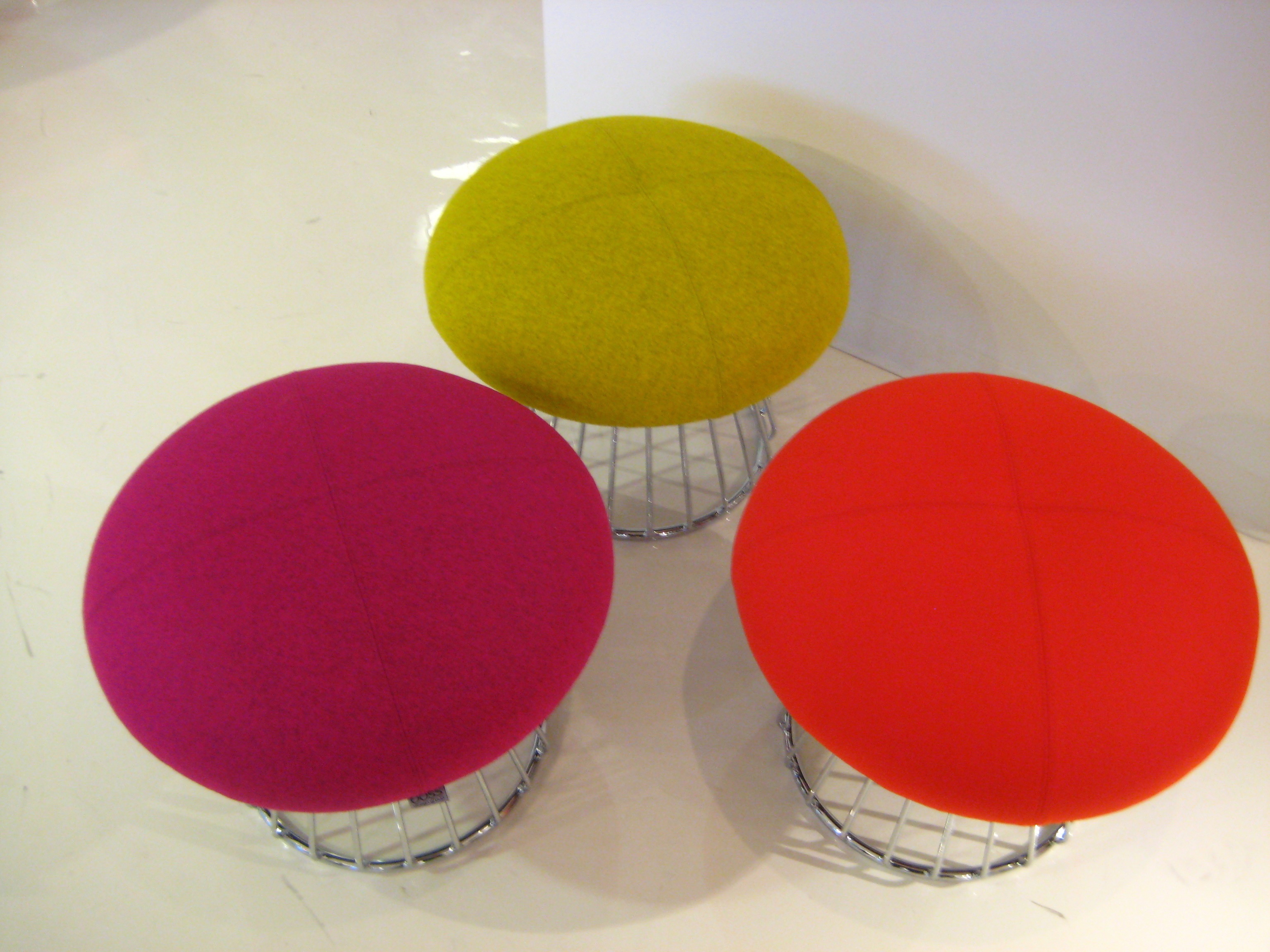
Felt: This one is huge! I saw this material everywhere in the show. Felt, brightly colored felt, was being used on everything from flooring to chairs to room dividers. Not sure if this is a response to the price of cotton in the world, but either way, manufacturers are putting it to great use in some unconventional areas.
Molded Plastic: If your chair is not covered in felt or wool, it most likely will be made of molded plastic or molded wood veneer. It is so nice to see the come back of molded design, Saarinen and Eames style. If we can start designing furniture like that again, I will be a happy man.
High-Back Furniture: I did see a lot of high-back chairs last year at the show, but this year it seems as though everyone has a high-back chair model. Most of the high-back chairs were angled at about a 110º angle. I’m thinking, and this is just my opinion, is that high-back chairs are meant to signal affluence and high-style. If that is the case, then I guess I’m out of style. Call me crazy, but I love lower, horizontal, and rectangular furniture.
Seclusion/Private Collaborative Work Areas: Again, this trend was big a few years ago at NeoCon and it’s not going away. Most of every retailer had some sort of seclusionary, collaborative workspace (some of them made of felt). It appears that this design is in response to companies who are looking for open-air working areas. Long gone are the days of the cube and the conference room.
Bright Colors: I’m not sure if this is just for the show, to gain attention; but most of the retailers had their furniture in bright, almost neon-like colors. I’m sure the brighter the colors, the happier the person using them; but come on, neon-yellow is just way too bright for most people. Just give me the chair in black and I can use it in any environment.
People Looking for Alcohol: Granted I did arrive mid-afternoon to the show, but it seemed as though people were on the prowl for alcohol; looking for the next open bar within a retailer environment. Yes, I’ve been to trade shows before, many different kinds; but I have never seen this level of excitement or anticipation for alcohol. I’m sure it was a long day for most people there, but come on people, this is Chicago, we have plenty of bars.
Other Trends: If it’s not organic in design (chairs), it’s very angular – no middle ground. Also, the use of hardened-foam in chairs and benches. I have a feeling that we’ll be seeing a lot more of this in the coming years.
This year, Chrysler stunned the advertising and consumer world with their “Imported from Detroit” rebrand. This rebrand effort was launched during the Super Bowl with the famous commercial featuring Eminem and his music. I will not lie, I was stunned at the excellent delivery of emotion from the folks at Chrysler and I had great hopes that this commercial would be the precursor to a rebirth of branding and advertising not just in the auto industry, but in the ad industry as well. Sadly though, my hopes were a little too high. Chrysler partnering with Wieden Kennedy, created an amazing foundation for a brand rebirth, but failed and continues to fail in execution and evolution of that rebrand.
There not doubt that the promotion of Saad Chehab to CEO of Chrysler and Lancia brands was a result of the Wieden Kennedy’s work with Chrysler. Chehab delivered on a promise to Detroit, to give hope, inspiration and sense of fight back into the people who have endured so much. Chehab said that he wanted to “capture the story of a downtrodden city with a glorious history that still had so much to offer.” That’s true; he with W+K helped bring that story to light. However, what has happened, and I am sure most people in Detroit are keenly aware of, the delivery of that story and offering is quickly dwindling if not completely gone.
This is Motor City, and This is What We Do
Eminem’s epic moment in the brand’s feature commercial was, not doubt spectacular, especially with the line “this is motor city and this is what we do.” Moreover was the introduction ahead of Eminem’s appearance, was much more powerful. The quick cuts of the real Detroit; the cold, the strength, the people and the faith the city has. The commercial told a story of those who have fought long and hard. Those people who have worked, those people who have never given up hope. The commercial followed the rules of emotional branding to their finer details. “The hottest fires forge the toughest steel.” Hope and ambition, strength and character, America and its people were the messages being drilled into our hearts. We did not weep when watching this commercial, rather we watched with open eyes and mouths while not breathing a single breath. We knew, just like those in Detroit, that this commercial, this message, meant something. It touched us in a way we haven’t felt in a long while. And there it was, emotion being applied to the brand. It was as if Chrysler never left us and never will. It was here to stay and lift us up from the dark.
That was the point of it all; hope and inspiration. Chrysler created something that we all believed in and we attached ourselves. If you notice, the car was in the commercial for all of 15 seconds. It wasn’t about the car, never should have been. It was about the people making it and the people around it.
And that’s the last we saw of that messaging.
Introduction of New Cities
I don’t know if it is easier to shoot in New York and LA, but that’s where the latest Chrysler commercials filmed from. I agree, that a brand needs to evolve and needs to seek out new landscapes, however, New York and LA are not related to Detroit even in the slightest. This rebrand was about blue-collar, the American struggle. New York and LA do not provide that persona at all. Nor is “Imported from Detroit” about fashion or hip-hop. The introduction of fashion designer John Varvatos in New York and Dr. Dre in LA do not align to the emotion already set.
Yes, Varvatos is from Detroit, but fashion is not and Dr. Dre is from LA. These are complete disconnects from the brand or what the brand is supposed to be about; or from what we gathered the brand is about. I know that Dr. Dre’s Beats Audio are integrated into some vehicles, but what about having those commercials shot in Detroit or city similar? What I don’t get is the fashion angle. How does fashion or a fashion designer relate to this campaign at all?
Eminem came from and will never leave Detroit. He has blue-collar in his blood. In fact, word on the street is that Chrysler and W+K had to prove that the campaign was going to reflect and promote Detroit and that Chrysler will never leave it. Well, fast forward 5 months and Chrysler left Detroit to shoot in LA and New York.
In my opinion, if you want to maintain that level of emotion around a city and its people, especially those who are hard working, determined and full of character, don’t leave that city. Make Detroit the epicenter of the rebrand. Align Detroit to Chrysler; align the people to the image. If you have to, move to a city much like Detroit such as Cleveland, Milwaukee, Pittsburg or St. Louis. It is very apparent that Chrysler, along with W+K have lost sight of the emotion they had originally created.
The Branding Dispute
Pure Detroit began selling apparel and other items with the “Imported from Detroit” slogan on them. Chrysler quickly came down on them with a cease-and-desist order and began to sue them. Yes, large brands know how to keep hold on their brand and enjoy controlling it and maintaining the image. Where Chrysler made the mistake was this case specifically. Given the fact that the rebrand was about Detroit’s people and the American people, the rebrand should have been allowed to evolve and be owned by the people. I’m all for brand equity and promote it with my clients. However, this case is different. The people of Detroit evangelized the brand after one, one commercial! This is unreal. This is free advertising, this is free advocacy and free recognition. Chrysler as a brand doesn’t have to do anything to move the brand forward, yet, they came down hard on the “working man” or the Detroit they have come to realize was always there waiting to be understood.
In this case, allow the merchants to create your brand for you. Allow the consumers to respond with faith in your brand and become inspired by the work they do to create the cars that you are selling.
Branding and Art Direction
The rebrand’s art direction is the brass tacks of what I’m concerned about. Coming from an Art Director background, watching this campaign unfold makes me cringe. The inaugural commercial had “feeling” belonging only to itself. When W+K or the other agencies working with Chrysler started rolling out traditional media, follow up commercials and microsites, the image and the emotion quickly fell apart.
If a large brand like Chrysler wants to rollout a campaign like this, it is required to have a cohesive image and message across all channels and outlets. You see below that the commercials do not have the same art direction as the traditional pieces. The websites do not live up to the image in the commercial as the sites are all about product and not image and emotion.
What I do have are stills from videos from the auto shows at the booths after the commercial aired. They are emotional, endearing, historic, and they tell a story of where we have been and where we are going – all without products. I want to sit in a Chrysler after seeing these images.
This slideshow requires JavaScript.
Here’s a solution, take visual cues from the commercials that made you great. Speak, through images and content about the story, about the emotion, about the city, and about life. Let the consumers make a connection with your story, then with your product.
What This Campaign Should Have Been About
In summary, this campaign should have been about hope, reality, inspiration, fight and pride. It should have been about the people and the feelings. Chrysler and W+K have failed at aligning meaning behind the rest of their approach to the brand that they started back in early 2011. Align back to Detroit, speak to the people that make that city great and this country great. Speak to sacrifice, hard work and determination. Speak to THEM and stop bringing us that which we cannot relate to. Do not leave Detroit, do not ignore the “blue-collar” worker and do not leave us like the brands before you.
Want to know what I’m talking about? Watch what Levi’s is doing.
It’s World Cup time everyone! (Well, it starts on Friday) Yes, I am becoming a little obsessed with the whole thing. The truth of the matter is, I love watching soccer, it’s exciting. Plus, during the World Cup, you have the whole wide world watching along with you. (How’s that for alliteration?)
This last weekend, I created my own bracket. Yup, I designed it. I have two versions here. One version includes my own selections of who will win and I’m sure there are a lot of you out there that will disagree with my choices, but, it’s all in the name of fun. And the second version is a blank bracket for you to download to choose your own winners. And, if you like, you can fill it out and share it with me.
Blank 2010 World Cup Bracket::
PS> I know that I do not have the USA going all the way, and that is sad. But, I will be cheering them on against England this Saturday in Chicago.
Just recently, my brother and principle designer, Eric Fescenmeyer, released his newest design incarnation, the Stalb Light, through Kassen Lifestyle.
The lamp is a simple structure made of steel, cast-concrete and recycled plywood. The lamps have an elegant shape that curve softly offering up a calming, yet, utilitarian aesthetic.
Eric says, “It’s rooted in true modernism. That’s because the Stalb not only recycles, but it also upcycles readily available organic materials. It’s about sustainability and real creativity.”
Such a simplistic structure, yet so elegant. The Stalb has a pleasant mixture of hard edges and soft curves. I believe it is rare to find such high design, mixed with recycled materials while maintaining a “truth to material” principle. (And I’m not just saying that because we’re related.)
They are available now through the website. It truly is “ahead of current trends.
About Kassen Lifestyle Kassen Lifestyle is a design firm located in the Midwest, specializing in well-made and forward-thinking true Modernist pieces, with an emphasis on the Brutalist precept of finding the beauty in everyday materials. The pieces created by Kassen Lifestyle are designed in-house, then handmade with solid, time-tested methods of construction and a constant vigilance to its core principles. More information on Kassen Lifestyle, its pieces and its principal designer, Eric Fescenmeyer, can be found at www.kassenlifestyle.com.
A little bit ago, I posted that I was working on a redesign of my website. Well, I’m happy to say, it’s completed. What has changed from the older site? Well, quite a bit actually.
For starters, the entire message of the site is different from the previous. The new message is about branding and social media; make your message the moment. This change in message is part-in-partial to the change in career path that I have undergone in the last two years. I’m no longer simply a designer, I have evolved to strategy, marketing and branding. The site’s purpose is to help explain just that; what I am all about, what I am capable of, and what qualifications I have. The site also helps explain how I might be able to help you or your business out. The redesign was to help make information about me and what I do more accessible to the public and potential clients.
Secondly, I needed to incorporate linking, personal and professional linking into my site. This is so you don’t always have to rely on what I give you on one site, but so you can research me, find out what I’m about, other places around the Internet. The linking also helps out with SEO, but I’ll get into that later.
Thirdly, the design needed to change. The mark of elegantbreakdown changed over the course of 2 years and needed to be incorporated into the new site as well as the color palette. The color is a bit intense and in your face, but you have to admit, it certainly does pop and you’ll remember it.
Coming soon, is the redesigned portfolio site to be used in conjunction with this site. The portfolio site will have the same design and aesthetic as this site and include design works that help illustrate how I can assist others visually, not just in strategy. The portfolio site will be up soon.
I had a lot of help with copy and critique on this site from friends and family. I have to give a special shout out to someone I will only refer to as “C” for the spectacular copy.
Hope you enjoy the new site. I hope you gain some sort of meaning of what I’m all about. I hope you don’t beat me up about the pink.
In the last year I have reinvented myself. My career path has evolved from design to strategy and social media. My personal website has yet to convey that evolution. Just to let you know, I’m trying my best to tackle this challenge, but with my contract work, it’s getting difficult to find time during the day. I think I need more hours.
There are a few things that I need to tackle when redesigning the site.
1) Message:
Quite important when establishing (or reestablishing) any brand. I know what my personal and professional message is, however, I need to actually get it on paper, or more specifically, typed out. Lately it seems that my clients’ messages have been taking front seat to my own.
2) Design:
Once my message has been established and typed out, I will design the aesthetic of my newly evolved personal brand and establish the flow of the site. I’m halfway there already; it will mirror the aesthetic you see here on the blog.
3) Linking it Up:
Integration of select inbound links with my site, is essential in my job. I suppose this will be apart of the “Design” process.
4) Getting the Message Out:
Once the message has been drafted, design completed, and the inbound links established, promotion begins. Whether it be through the inbound links, in-person networking, or another aspect of promotion, I’m uncertain at this junction. But, what I do know, is it will require a firm SEO strategy.
So, that’s where I’m at right now with my personal site. I want to make it clear, that when I’m discussing the “personal site,” I’m not referring to the blog you’re reading now. So, please be patient, it’ll be live soon.