The #KingJames #HardWorkTogether Nike Spot Needs a Better Insight

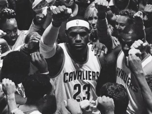
Nike Basketball, in partnership with Wieden+Kennedy, released a LeBron James comeback spot titled, “Together”. It is an “emotional” spot depicting King James’ return to the city of Cleveland. It has been getting a lot of PR and positive reviews lately, especially in the creative industry. Where it is an emotion-provoking spot, beautifully crafted, I began to wonder if the insight was correct.

Let’s take a step back in time. Back in 2010, LeBron “announced” to the world that he was leaving Cleveland to join the Heat in Miami. LeBron’s ego-driven press conference was not well received, to stay the least, in Cleveland. You even had the owner of the Cavs, Dan Gilbert, say that LeBron’s actions were a “cowardly betrayal” and went on to say, “the good news is that the ownership team and the rest of the hard-working, loyal, and driven staff over here at your hometown Cavaliers have not betrayed you nor NEVER will betray you.” These are pretty heated words born out of a lot of negativity, disappointment, disgrace and betrayal. We all began to wonder if Cleveland would ever want a part of LeBron again.

Now, without going too far into LeBron’s resigning with the Cavs, I think it’s more important to note the negative sensitivity that existed in Cleveland only four years ago. Now, in 2014, all of a sudden it is the “return.” LeBron is welcomed back with open arms by the city he put behind him in the most publicly and somewhat humiliating way? That being said, let’s look at the spot.

Hard work, together. It’s an inspiring and hopeful phrase. The film depicts the entire city coming together and building themselves to a hopeful epoch. It’s the Hope campaign all over again. As I watched this and I remember the past, and as a strategist who prides himself on human truths, I wonder if “Hope” and “Togetherness” was the right idea for the insight. Or, more specifically, I wonder if the insight was correct.

LeBron Together Spot - Nike - Arena

To me, this whole “return” is more dramatic than simply positivity and hope. It’s more than holding our hands and singing kumbaya. It’s more than just the gritty black and white film, it’s more than just giving back to a city that was once destroyed by an ego. And it’s way more than just showing people coming together. To me, the insight is more about the prodigal son returning.

The age old story about a son who disavowed everything and everyone who helped raise him. It’s a story about not being mature and only realizing that once he is out in the world. It’s more about coming home and being humble. It’s about being more than just a star, it’s about giving back, making amends and more so, it’s not about playing a game of basketball to ask for forgiveness.

Together also reminds me of another spot, “Made in New York featuring Derek Jeter. This was a film right on message. It conveyed the true feeling New Yorkers and all those who love baseball had about Jeter. It summarized his character and how the city, how the world truly felt about the man, then the sport. It wasn’t about ego, it was about thanking people.

Just as much as the Gatorade ad, the Together spot is beautifully crafted, it does have the “goose bump inducing” feeling. The ad has a grit to it, it has a feeling of truth and it has an emotive undertone. But the message of Hard Work, Together is about a city rising from the ashes, not about an NBA star telling them how to do so.

The “Value” of Super Bowl Advertisements

Even though Super Bowls can be a bit of a let down, advertisers and brands swarm to get spots for the Super Bowl. Case in point, all of the Super Bowl ad spots were sold out before Thanksgiving this year. This is mainly due to brands wanting to get in front of one of the largest audiences to view television programs. It is predicted this year there will be 100 million people watching the Super Bowl; and at a price tag of $3.5 million dollars for a 30 second spot, it may seem like a deal. However, I’m not sure that the brands truly recognize the value of the spots or the return they may, or may not get from them.

>> Read more at Experience Matters…

A Critique of Chrysler’s “Imported From Detroit” Branding

This year, Chrysler stunned the advertising and consumer world with their “Imported from Detroit” rebrand. This rebrand effort was launched during the Super Bowl with the famous commercial featuring Eminem and his music. I will not lie, I was stunned at the excellent delivery of emotion from the folks at Chrysler and I had great hopes that this commercial would be the precursor to a rebirth of branding and advertising not just in the auto industry, but in the ad industry as well. Sadly though, my hopes were a little too high. Chrysler partnering with Wieden Kennedy, created an amazing foundation for a brand rebirth, but failed and continues to fail in execution and evolution of that rebrand.

There not doubt that the promotion of Saad Chehab to CEO of Chrysler and Lancia brands was a result of the Wieden Kennedy’s work with Chrysler. Chehab delivered on a promise to Detroit, to give hope, inspiration and sense of fight back into the people who have endured so much. Chehab said that he wanted to “capture the story of a downtrodden city with a glorious history that still had so much to offer.” That’s true; he with W+K helped bring that story to light. However, what has happened, and I am sure most people in Detroit are keenly aware of, the delivery of that story and offering is quickly dwindling if not completely gone.

This is Motor City, and This is What We Do
Eminem’s epic moment in the brand’s feature commercial was, not doubt spectacular, especially with the line “this is motor city and this is what we do.” Moreover was the introduction ahead of Eminem’s appearance, was much more powerful. The quick cuts of the real Detroit; the cold, the strength, the people and the faith the city has. The commercial told a story of those who have fought long and hard. Those people who have worked, those people who have never given up hope. The commercial followed the rules of emotional branding to their finer details. “The hottest fires forge the toughest steel.” Hope and ambition, strength and character, America and its people were the messages being drilled into our hearts. We did not weep when watching this commercial, rather we watched with open eyes and mouths while not breathing a single breath. We knew, just like those in Detroit, that this commercial, this message, meant something. It touched us in a way we haven’t felt in a long while. And there it was, emotion being applied to the brand. It was as if Chrysler never left us and never will. It was here to stay and lift us up from the dark.

That was the point of it all; hope and inspiration. Chrysler created something that we all believed in and we attached ourselves. If you notice, the car was in the commercial for all of 15 seconds. It wasn’t about the car, never should have been. It was about the people making it and the people around it.

And that’s the last we saw of that messaging.

Introduction of New Cities
I don’t know if it is easier to shoot in New York and LA, but that’s where the latest Chrysler commercials filmed from. I agree, that a brand needs to evolve and needs to seek out new landscapes, however, New York and LA are not related to Detroit even in the slightest. This rebrand was about blue-collar, the American struggle. New York and LA do not provide that persona at all. Nor is “Imported from Detroit” about fashion or hip-hop. The introduction of fashion designer John Varvatos in New York and Dr. Dre in LA do not align to the emotion already set.

Yes, Varvatos is from Detroit, but fashion is not and Dr. Dre is from LA. These are complete disconnects from the brand or what the brand is supposed to be about; or from what we gathered the brand is about. I know that Dr. Dre’s Beats Audio are integrated into some vehicles, but what about having those commercials shot in Detroit or city similar? What I don’t get is the fashion angle. How does fashion or a fashion designer relate to this campaign at all?

Eminem came from and will never leave Detroit. He has blue-collar in his blood. In fact, word on the street is that Chrysler and W+K had to prove that the campaign was going to reflect and promote Detroit and that Chrysler will never leave it. Well, fast forward 5 months and Chrysler left Detroit to shoot in LA and New York.

In my opinion, if you want to maintain that level of emotion around a city and its people, especially those who are hard working, determined and full of character, don’t leave that city. Make Detroit the epicenter of the rebrand. Align Detroit to Chrysler; align the people to the image. If you have to, move to a city much like Detroit such as Cleveland, Milwaukee, Pittsburg or St. Louis. It is very apparent that Chrysler, along with W+K have lost sight of the emotion they had originally created.

The Branding Dispute
Pure Detroit began selling apparel and other items with the “Imported from Detroit” slogan on them. Chrysler quickly came down on them with a cease-and-desist order and began to sue them. Yes, large brands know how to keep hold on their brand and enjoy controlling it and maintaining the image. Where Chrysler made the mistake was this case specifically. Given the fact that the rebrand was about Detroit’s people and the American people, the rebrand should have been allowed to evolve and be owned by the people. I’m all for brand equity and promote it with my clients. However, this case is different. The people of Detroit evangelized the brand after one, one commercial! This is unreal. This is free advertising, this is free advocacy and free recognition. Chrysler as a brand doesn’t have to do anything to move the brand forward, yet, they came down hard on the “working man” or the Detroit they have come to realize was always there waiting to be understood.

In this case, allow the merchants to create your brand for you. Allow the consumers to respond with faith in your brand and become inspired by the work they do to create the cars that you are selling.

Branding and Art Direction
The rebrand’s art direction is the brass tacks of what I’m concerned about. Coming from an Art Director background, watching this campaign unfold makes me cringe. The inaugural commercial had “feeling” belonging only to itself. When W+K or the other agencies working with Chrysler started rolling out traditional media, follow up commercials and microsites, the image and the emotion quickly fell apart.

If a large brand like Chrysler wants to rollout a campaign like this, it is required to have a cohesive image and message across all channels and outlets. You see below that the commercials do not have the same art direction as the traditional pieces. The websites do not live up to the image in the commercial as the sites are all about product and not image and emotion.

What I do have are stills from videos from the auto shows at the booths after the commercial aired. They are emotional, endearing, historic, and they tell a story of where we have been and where we are going – all without products. I want to sit in a Chrysler after seeing these images.

This slideshow requires JavaScript.

Here’s a solution, take visual cues from the commercials that made you great. Speak, through images and content about the story, about the emotion, about the city, and about life. Let the consumers make a connection with your story, then with your product.

What This Campaign Should Have Been About
In summary, this campaign should have been about hope, reality, inspiration, fight and pride. It should have been about the people and the feelings. Chrysler and W+K have failed at aligning meaning behind the rest of their approach to the brand that they started back in early 2011. Align back to Detroit, speak to the people that make that city great and this country great. Speak to sacrifice, hard work and determination. Speak to THEM and stop bringing us that which we cannot relate to. Do not leave Detroit, do not ignore the “blue-collar” worker and do not leave us like the brands before you.

Want to know what I’m talking about? Watch what Levi’s is doing.

Recap: The Chicago Auto Show

Saturday, I had the opportunity to check out the 2011 Chicago Auto Show with my brother Eric. Now, I for one absolutely love auto shows. Perhaps I love them because I grew up liking automobiles, maybe it’s because I’m a guy and guys “like that sort of thing,” or maybe it’s because auto shows are just plain cool. Regardless, auto shows are fun and this year’s show illustrated how integrated our culture is becoming with technology and communications. I noticed two activities the auto manufacturers were investing in, they were social media interaction and interactive, on-site engagement.

Social
Social was a very large component in the majority of the large auto manufacturers’ displays. Here is a rundown of how some the auto companies engaged socially.

• Volkswagon: Upon arrival to the Auto Show, I checked into the Chicago Auto Show via Foursquare. Very soon after, I received a tweet from @VWConnect stating, “Stop by the VW booth to see the all-new Jetta GLI & find out how to get a free T-shirt,” with a TwitPic of a VW GLI. Yes, it was a bot Twitter account, but it served its purpose. I was immediately intrigued by what they had going on and that they were engaging me based upon my location. I headed over to the VW booth to find out more.

I came up to the new model year Passat and noticed it had a CTA image on the vehicle. The image directed me to take a listen to the stereo, tweet about it, and find a Product Specialist. Well, I bypassed those directions and went to the Product Specialist. She was there with T-Shirts in hand, standing right next to the vehicle. She informed me that had I tweeted about the vehicle, she would have taken down some information (for direct mail purposes) and given me a VW t-shirt to take home.

    Pros: VW was highly engaged both online and off. The incentive was adequate for the promotional needs. It was a great way of directing online, to a socially engaged, real-life specialist.
    Cons: Twitter bots are sometimes overwhelming and people don’t respond to them that well. Taking down my information after I did all those steps for VW, was a big of a large ask.

• Audi: Audi used location based services to generate awareness and engagement. Audi featured a couple of signs that directed the public to check into the Audi booth via both Foursquare and Facebook Places. As far as I could tell, there wasn’t much of an incentive to do so. However, I have to say this: I didn’t check in. So, with that said, who knows what was on the other side of the check-in. Either way, it wasn’t mentioned on the signage what would happen if you did check in.

    Pros: Promoting the use of location based services through signage.
    Cons: No real or clear incentive to check-in to the services.

• Chrysler: Chrysler had a simple black-and-white flyer they handed out to attendees of the show. One side featured all of their social accounts with a CTA that asked the attendees to become a fan of their pages and upload images, video and editorial from their experience at the show.

The second side was a CTA to engage the brand through text messaging. Text “Chrysler” to a number, explore the booths, answer questions that were texted back, and get a reward at the information desk. The rewards varied from an eco-friendly bag to a 3-for-1 oil change. A good use of texting, however, it seemed to be a bit of an arduous task.

    Pros: Using texting instead of social to interact with the attendees was different from most OEMs. The 3-for-1 oil change reward was pretty good.
    Cons: Attendees have to pay for the texts. Who knows when else Chrylser will text the attendees. And the photocopied flyers were a very passive approach to social media.

• Chevrolet: Chevrolet had a “bullet-time” photo booth in conjunction with Hot Wheels. Attendees waited in line to get their photo taken in front a Chevy vehicle, were offered a physical copy of the photography, and had the option to post that photo on Facebook or other social media platform.

I didn’t participate in this one; the line was way too long. However, I can only assume Chevy got a great turn out, a lot of social information on attendees, and the offer for participation was pretty innovative. I mean really, where else can you get a photo of yourself in bullet time?

    Pros: Innovate and interactive booth with a social component on the backend.
    Cons: Very long line to wait.

• AutoTrader: AutoTrader, much like VW, had a Twitter bot engage the attendees after an Auto Show Foursquare check-in. Their tweet read, “Thanks for joining us at the Chicago Auto Show! Fly by AutoTrader.com’s booth with this tweet for a prize” offered a clear call to action with a plus up incentive. If it was anything like the LA Auto Show, you get a picture with someone you’ve never heard of, a pencil and a small carrying case. I admit, I didn’t try this one either; I already have a pencil.

    Pros: A quick social response with an incentive back end.
    Cons: Again, a Twitter bot engagement tactic. However, with that said, how else would we know to go over to the booth?

Interactive
The second major piece of the Chicago Auto Show were interactive displays. The auto manufacturers really stepped up their game this year. Let me quickly go through some of the more memorable displays.

Overall: QR Codes were in heavy use with every sort of CTA ranging from vehicle information, to connecting on Facebook, to engaging dealerships. It seems as though QR codes are becoming more prevalent in the industry and used more by the public.
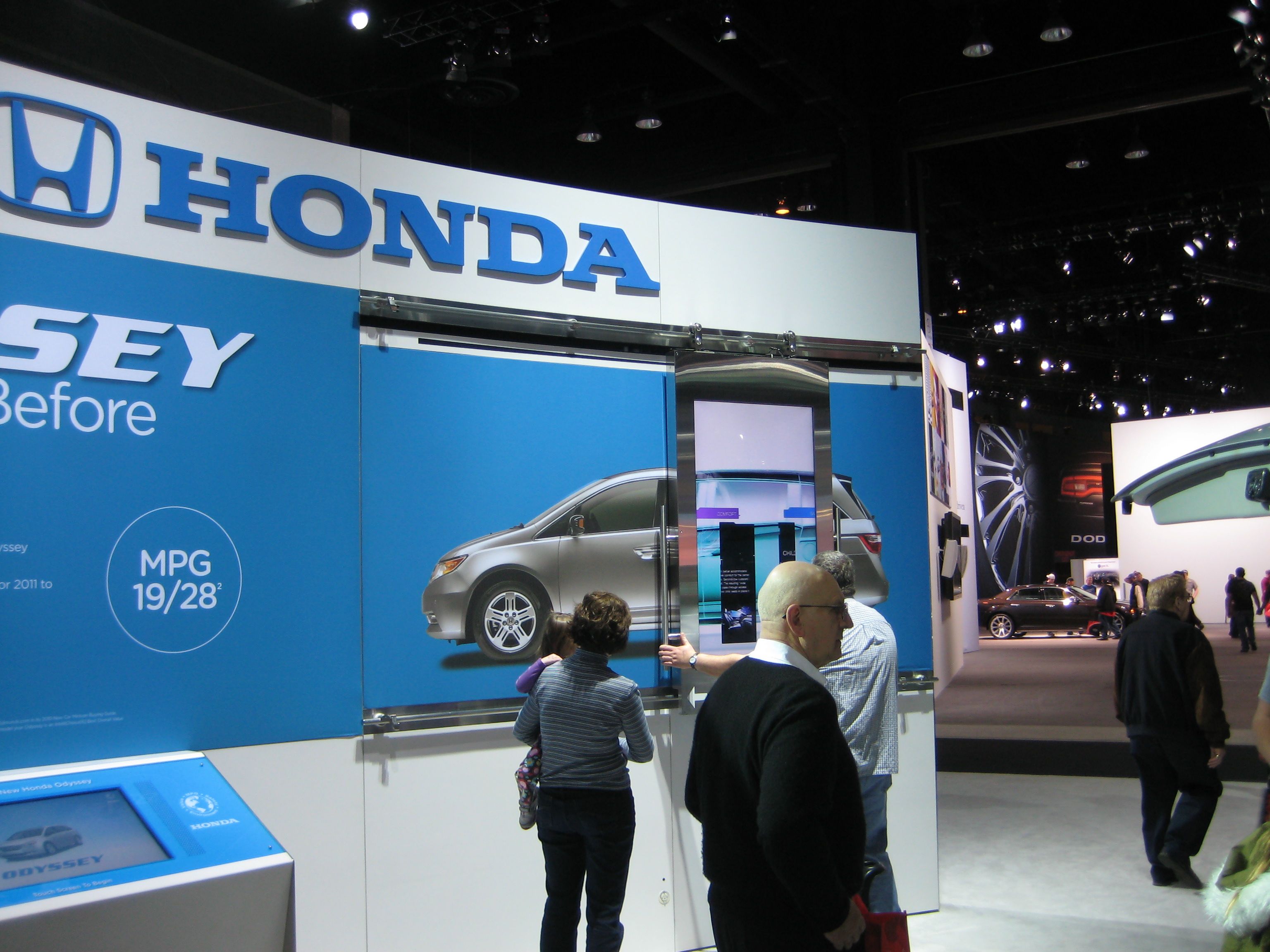
Honda: Honda had an “X-Ray” like display. Basically, there was an image on a wall of a Honda minivan. There was a screen on rails affixed above the image. The attendee would move the screen back and forth over the image to give a detailed, x-ray like, look at the vehicle. The display didn’t work all that well, but the public didn’t seem to mind as they enjoyed just playing around with it.

Fiat: Fiat used an X-Box Kinect interface. An attendee would stand behind the kiosk, waive their hands and interact with a large television screen filled with images and information. The attendee would select one of the images, an informative piece, or video would display and the attendee selected another one. This display had a very high level of interaction and a clear description on how to use it. However, the screen was pretty distant and made it difficult to read the information.

Scion: Scion used 3D video to engage the attendees. The Product Specialists gave out the glasses and all you had to do, as an attendee, was sit down and watch a 3D Scion movie. It was pretty simple, however, offered little interaction.

Chevrolet Volt: The booth for the Volt alone, was larger than some of the other auto manufacturer’s booths overall. The Volt offered a serene test track that allowed the attendees to ride in the car through a beautifully landscaped roadway. Once you walk up to the track, you are inundated with the smell of fresh plants, trees and grass. The attendee didn’t get to drive the Volt around the track, which was about the size of a large go-kart track, they were chauffeured. The line to get in the Volt wrapped around the track. It was a site to see and a calming booth to visit with all the foliage.

Toyota: Toyota’s Prius display was pretty large, bright, and spoke to the “Prius Goes Plural” campaign. At the base of the booth, was a station to charge your mobile phone. Toyota offered, from what it seemed, every type of mobile phone chargers. I think Toyota understood perfectly what type of world we live in right now. Also, when the attendee charged their phones, a Product Specialist would sit with them to chat. I’m not one to be suckered into this sort of conversation, but when you need your phone charged, you will do just about anything.

So, that was just a part of my experience at the auto show. I truly do enjoy auto shows; the designs of the cars, the booth displays, and the unique approaches auto manufacturers use to get our attention. However, one major downside to the show was the shear amount of people in attendance. I think the flow of the show needs to be reevaluated from a perspective of the volume of people. That was just about the only downside, and looking at it from a marketing perspective, it’s certainly an upside.

Shout Out: Thank you Lindsay for the tickets!

Furniture Design: Stalb Light

Just recently, my brother and principle designer, Eric Fescenmeyer, released his newest design incarnation, the Stalb Light, through Kassen Lifestyle.

The lamp is a simple structure made of steel, cast-concrete and recycled plywood. The lamps have an elegant shape that curve softly offering up a calming, yet, utilitarian aesthetic.

Eric says, “It’s rooted in true modernism. That’s because the Stalb not only recycles, but it also upcycles readily available organic materials. It’s about sustainability and real creativity.

Such a simplistic structure, yet so elegant. The Stalb has a pleasant mixture of hard edges and soft curves. I believe it is rare to find such high design, mixed with recycled materials while maintaining a “truth to material” principle. (And I’m not just saying that because we’re related.)

They are available now through the website. It truly is “ahead of current trends.

About Kassen Lifestyle
Kassen Lifestyle is a design firm located in the Midwest, specializing in well-made and forward-thinking true Modernist pieces, with an emphasis on the Brutalist precept of finding the beauty in everyday materials. The pieces created by Kassen Lifestyle are designed in-house, then handmade with solid, time-tested methods of construction and a constant vigilance to its core principles. More information on Kassen Lifestyle, its pieces and its principal designer, Eric Fescenmeyer, can be found at www.kassenlifestyle.com.

Photography Credit: Artemio Photography

Recap: The Marriage of Figaro

I recently had a wonderful opportunity to go see the Skylight Opera Company’s rendition of The Marriage of Fiagro last week with my friend Matt. I have to say, what an amazing performance across the board.

First off, the opera was performed in English. Yes, different from the original Mozart composition, however, having it performed in English really helps out in the overall understanding of what specifically is being said during the performance. English did not really have that much of an adverse effect in the performance. There were a few points where you could tell the performers had a difficult time saying an English word instead of the original Italian, but they pulled it off admirably.

The orchestra was comprised of woodwinds and a piano. Going into the show, I didn’t know how this would play out, musically speaking, but it seemed to work very much in favor of the performance. Not too loud, not too soft; just right.

Art direction was pretty well executed. The costumes and make up were brilliant and historically accurate. Stage design was adequate to fit the needs of the performance, however, I think the painting could have been a bit better. Stage lighting was excellent. Great mood setting blues and yellows.

The performers were excellent, all of them. I would like to point a few out. Diane Lane who played Cherubino, Alicia Berneche who played Susanna, and Tanya Kruse who played Countess, all have some of the most amazing operatic voices. And last, but certainly not least, Susie Weidmeyer, who played Barbarina, has a stunning operatic sound and a great solo in the second half.

Overall, the performance was amazing, the night perfect and the company fantastic. I highly recommend you spend some quality time taking in one of Mozart’s greatest operas at the Skylight. Act quickly, for they’re only performing it until Valentine’s Day.

Recap: Gallery Night – Winter 2010

I just got back from a whirlwind tour of Gallery Night in Milwaukee, in the Third Ward. First off, my friend Bridget and I got a late start to the evening. So, we were a bit rushed right off the bat. No bother though, we knew where we wanted to go and what we wanted to see, which helps a lot during a Gallery Night evening.

Our first stop was to the Milwaukee Public Market for some letterpress prints. Very cool prints, however, they were few and far between. Color was spot on, although, I wish they were a bit larger. Overall, cool prints.


Our second stop, after the Public Market and Starbucks, was Cranston in the Marshall Building on Water Street. It’s one of my standard stops during Gallery Night it seems. But, out of all night, it proved to be the most fruitful. I didn’t get a chance to see who created the prints, like the one you see, but they were amazing. So beautiful were the colors, the aesthetic, texture and imagery. These prints were simply intoxicating. What a great find tonight!

After Cranston, we head over to (Shoo) for some beautiful, vivid landscapes. I guess there were custom Chuck Taylors, but I didn’t see them. After which, we ran over to the Dye House for a Bob Marley photo exhibit. Standard portraiture, nothing that hasn’t been done before.

Unfortunately, time was not on our side and we had to head back. It was a cold night and the coffee’s that we got, helped out a great deal! I would like to throw out a personal thanks to Bridget for being an amazing companion on the whirlwind Gallery Night tour.

OpEd: Never Fear Critique When Designing

Let me start out by saying that no one is perfect and there is no one right or perfect designer. If there were, we would all hail that person as the messiah of design. Now, granted, we all have out ideal candidates for the high and mighty, end-all-be-all designer, but no one truly is. And especially us, we are not perfect nor do we make perfect designs every-time. And we must remember that. We must remember humility.

Every designer loves to critique other designs, other advertisements, clothing, music, etc. What we may not realize, all the time, is that all those designs, advertisements and clothing are designs and subsequently designed by someone, a designer. We are critiquing someone’s design. It’s not fair to  not expect it back in return. In fact, being critiqued or opening up dialog about your work will bring about new ideas, approaches and insights that you may not have thought of. Who knows, these insights might prove to be very important for the next stage of your design. Alternatively, it is important for the designer to share their designs with another designer for obvious defects and offer a chance for the designer to present and articulate their thoughts. A time to prove your work.

Remember, humility is key in design. No one is perfect. We can strive for the perfection, ultimately that perfection comes in part through the openness to others and critique. Think of it as a type of oversight.

Design is a rough profession. There are no lollipops or rainbows. There are crushed feelings, harsh words, dropped jobs and always someone better than you. In order to survive, you must be aware of this. A think skin is necessary. They aren’t critiquing you personally, they are critiquing your work. If you can’t separate that or disassociate yourself personally from critique, you should think of another game.

Somethings to keep in mind when working and critiquing:
1) Never take criticism personally.
2) Elitism should never be tolerated.
3) It’s not about your work, but the work period.
4) Oversight in design is necessary and should be encouraged.