Infographic: Resume Version 2.0

Leif Fescenmeyer Resume Infographic


It’s been a long time since I published on this blog; I figured I would go back and revisit one of the more popular posts since the blog’s inception. I’m going back 10 years ago to the resume infographic post. Back then, I was aspiring to become part of the agency landscape once again after taking on my own clients for a while. Since then, I have been on a long and very productive agency career which has yielded some of the best experiences of my professional life; everything from creating a global social media infrastructure for a consumer electronics brand, to developing best in class eCommerce strategies for the world’s largest CPG brand, to collaborating on the strategy to launch the first mass-production electric vehicle in North America.

I’m happy to present to you my updated resume infographic. For those of you who don’t know how the first version was structured, here’s an overview:
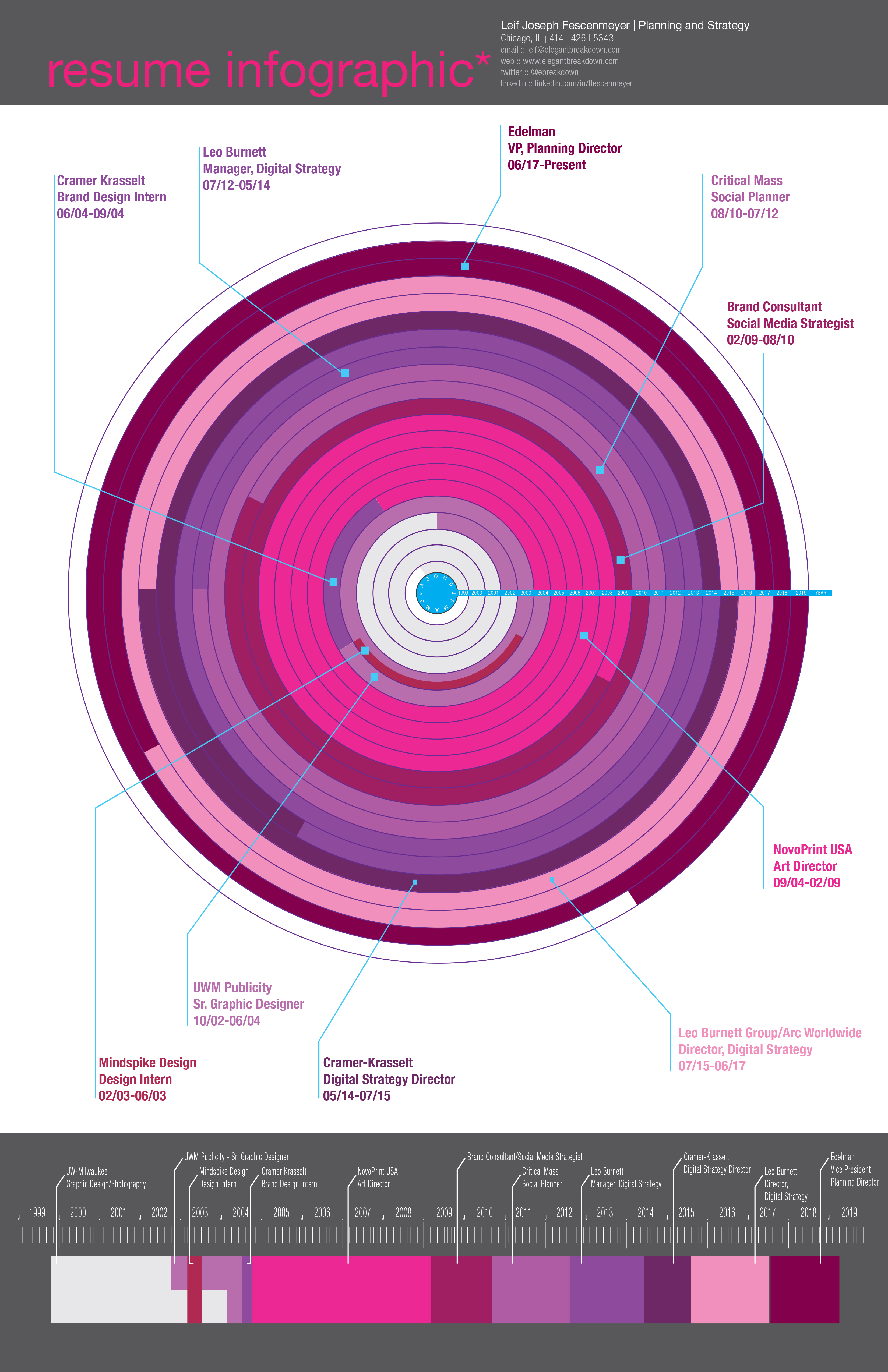
Section One:
At the top, you will see the title of the graphic, my name, title and contact information.
Section Two:
Probably the most visually appealing graphic of the document, the work wheel. This graphic represents the work timeline from 1999 to now 2019. And wrapped around the wheel is the visual chronicle of my work history separated by colors. Lines coming from segments of the wheel define where I worked and when.
Section Three:
At the bottom of the infographic is more of a linear timeline of my career path. Color of the timeline corresponds to the place of employment just like in the work wheel above. This timeline is simple, linear and gives you a different representation of work history.

For those of you who would like to learn more about my career history and strategic trajectory, I invite you to connect with me on LinkedIn. As far as the next infographic to come out; well I have no idea what it’s going to be just yet. I’m working on finding a subject matter. And of course, if you have a suggestions, don’t hesitate to let me know.

Infographic: Resume

(Click image to zoom in. Right click; save target as to save)

About a week ago I created my first infographic. That first infographic chronicled my life, interests, professional path and education from the age of 15 to 29. The “Life Infographic” was met with critical acclaim. A lot of people enjoyed reading and viewing it. Of course they did, we’re all visual people in nature.

Within that last post, I mentioned that I was attempting to create another infographic chronicling only my professional career, more of a visual resume. Well, I’m happy to announce that the “Resume Infographic” is completed.

The “Resume Infographic” is composed of three main sections:

• Section One:
At the top, you will see the title of the graphic, my name, title and contact information.

• Section Two:
Probably the most visually appealing graphic of the document, the work wheel. This graphic represents the work timeline from 1999-2010 and wrapped around the wheel is the visual chronicle of my work history separated by colors. Lines coming from segments of the wheel define where I worked and the job duties I had.

• Section Three:
At the bottom of the infographic is more of a linear timeline of my career path. Color of the timeline corresponds to the place of employment just like in the work wheel above. This timeline is simple, linear and gives you a different representation of work history.

The “Resume Infographic” is created in a tabloid format for ease of printing. I heard a few responses from the previous infographic that it was a bit large and hard to read, even after zooming in. I took that criticism and changed things up a bit in this infographic, making it more printer friendly.

As far as the next infographic to come out; well I have no idea what it’s going to be just yet. I’m working on finding a subject matter. And of course, if you have a suggestions, don’t hesitate to let me know.

Infographic: A Visual Chronicle of My Life

For a while now, I’ve been looking at a lot of “infographics” on the Internet. Mainly, they’re graphics about science, politics, financials and whatever. But recently, I stumbled across someone’s infographic that has detailed his life from a certain age; chronicling his education and interests. What a great idea! I have been wanting to create one for myself for years. Well, I finally have.

Simply titled, “Life Infographic,” this particular graphic chronicles many facets of my life from the age of 15. Why start with that age? Well, it’s the start of my high school career; the start of the passions and interests I have today. Plus, I don’t think anyone would be interested in all the little bits of life before that.

There is a lot in this graphic, so let me give you a bullet point of what you can find. (From the top-down.)

• Location: Simply, where I have lived during the course of the timeline.

• Education: Shown in the background, this layer represents where and when I went to school and for what.

• Professional Skills: The warm colored bars depict the skill sets and knowledge I gained during this time. It also shows how long I used these skills.

• Career: Basically where I worked and what job I had.

• Age: This is the important bit. The age timeline is what everything in the infographic is based upon.

• Interests: The cool colored bars depict the interests I had outside of the career path and professional skills. Things that I was/am interested in as hobbies or general interest.

• Events: Significant events that have happened to me at certain times in the last 15 years. The interest bars rise up to interact with the professional skills and interests to give you a better representation of where certain skills and interests come from.

Well, that’s the ride around the block for the infographic. I have to say, the most difficult part of this process was determining what goes into the graphic, how to represent the flow, and oddly enough, what colors to choose. I really loved creating this infographic, so now I am in the process of creating another for only my professional timeline; kind of like a visual resume.

I hope gain more insight into who I am, where I came from and what interests me. But most of all, I just hope you enjoy it.

(Also, I need to give an inspiration shout out to the person who created LifeMap. Viewing this finally got me to create my own.)